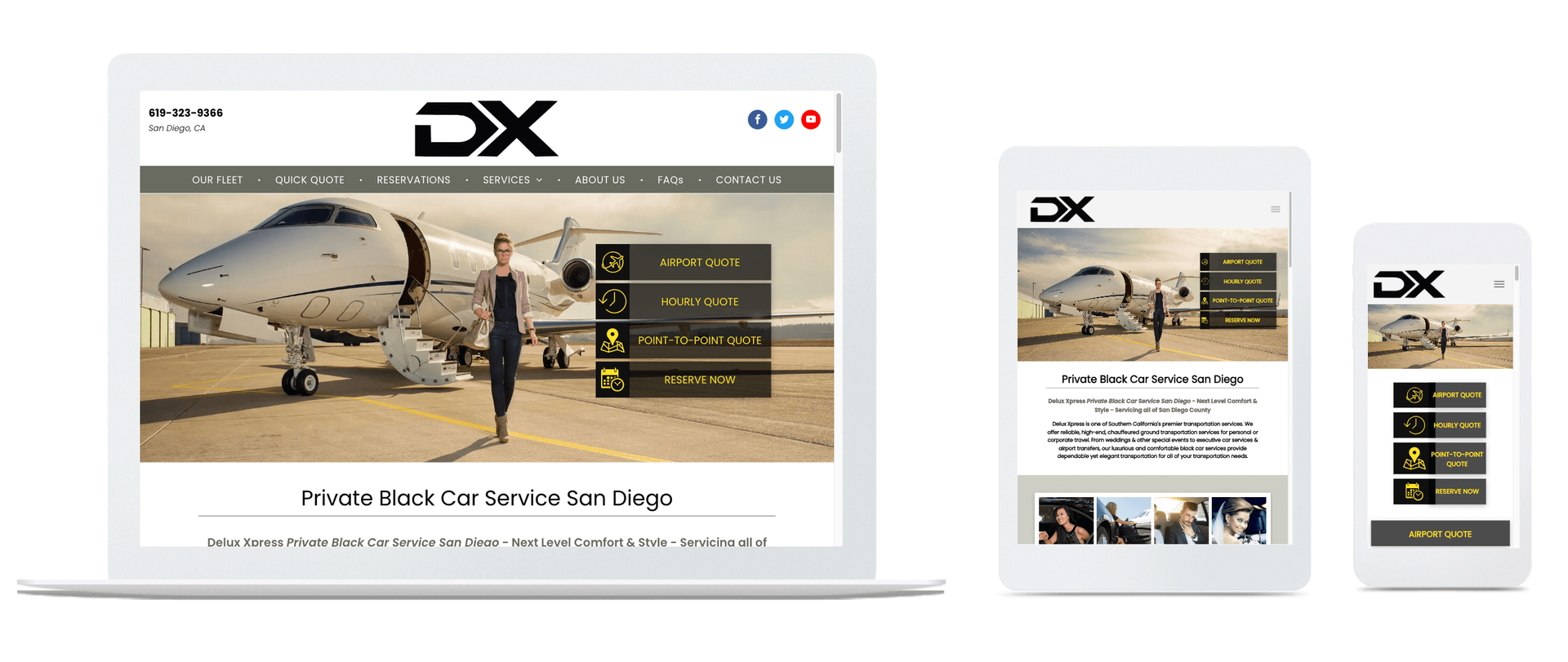
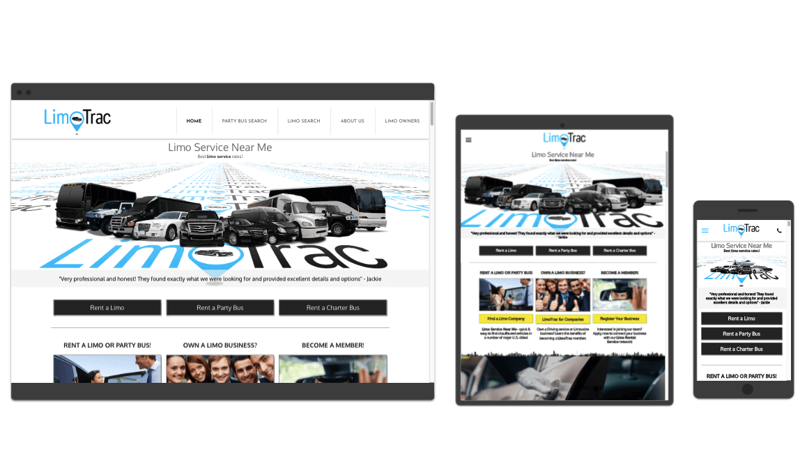
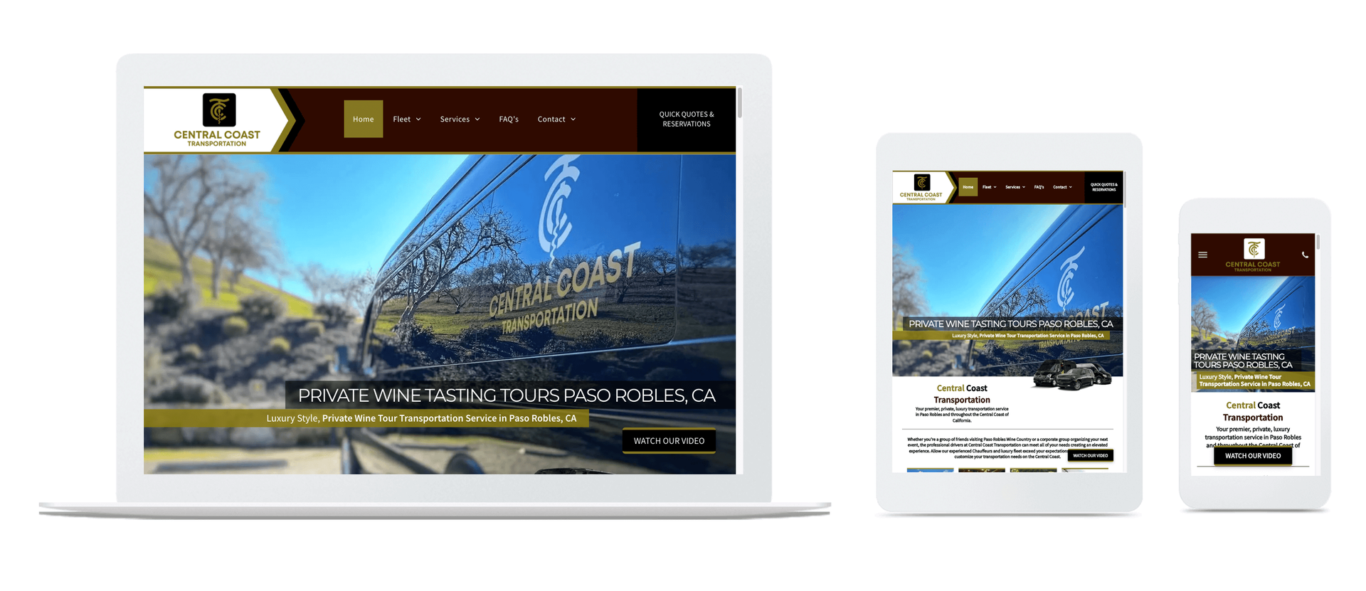
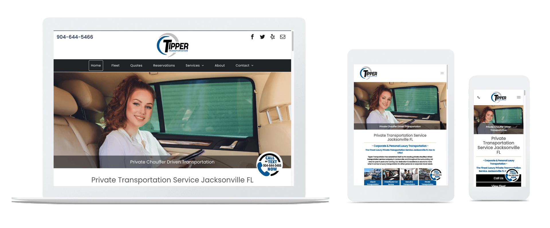
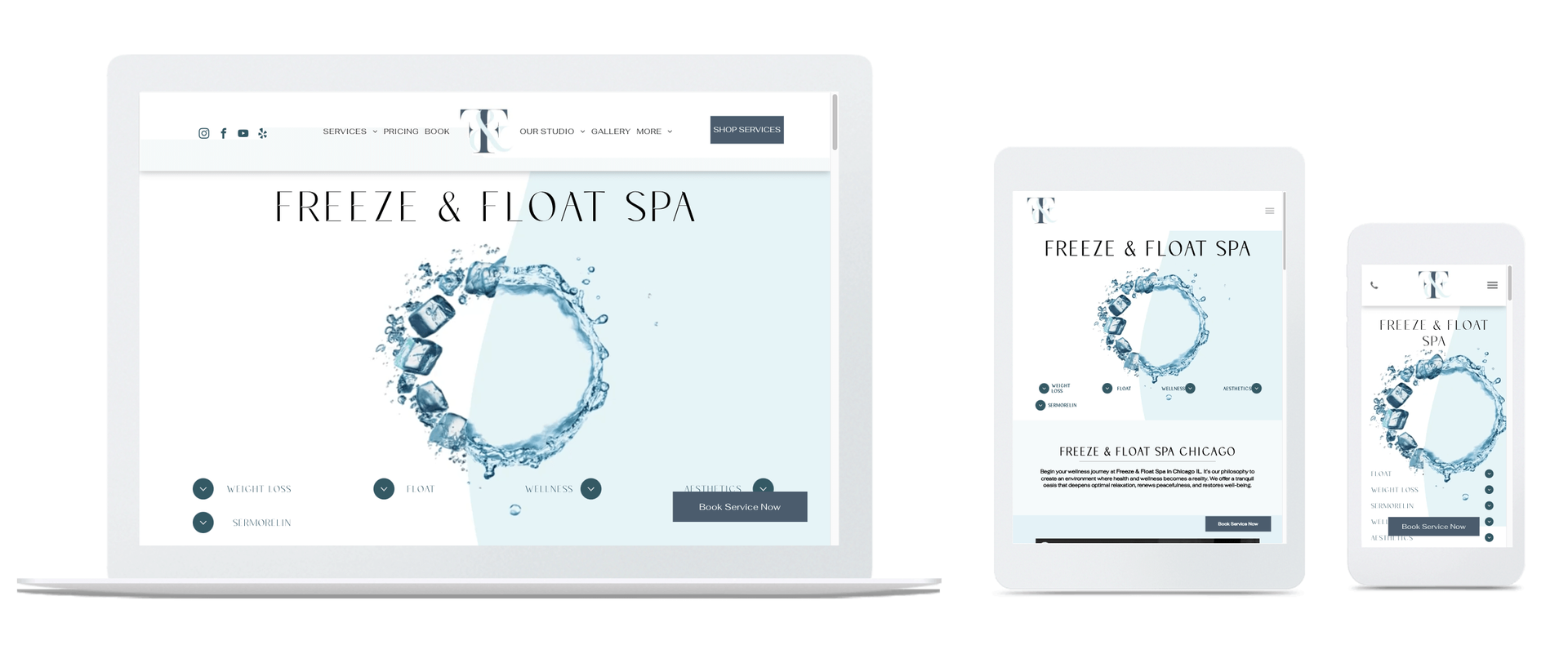
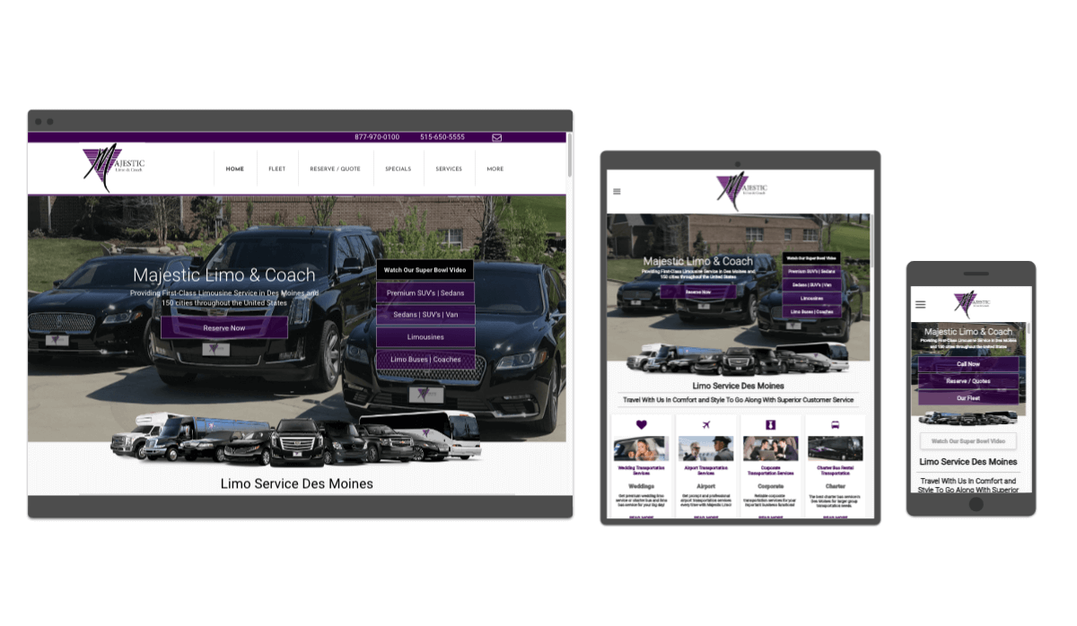
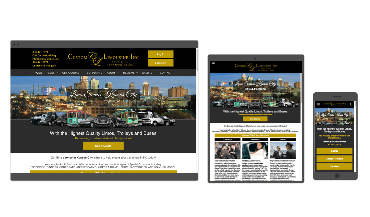
Responsive Web Design
3-in-1
Mobile Web Integration
A
responsive web design is a 3-in-1 website which automatically converts for desktop, smartphone and tablet. The website is responsive to format and display properly depending on the size of screen that is viewing your website.
Our website is a responsive web design, so you can view it on different devices to see how it auto-formats to each device for premium user experience.

Mobile Responsive Web Design Benefits
Mobile responsive websites
are built with mobile applications such as click-to-call, mobile mapping, click-to-text, reviews, form submissions, hours, specials (coupons), social media integrations and much, much more. Plus, to truly benefit your company, we provide a built in social media share button for ultimate word-of-mouth social feeds.


Veer Mobile -
Mobile web and
mobile responsive web design company operating nationwide and based in Hollywood, Los Angeles, Beverly Hills, North Hollywood, CA,
Kansas City, KC, KCMO.